CustomMenu

Monday, June 30, 2014

Iron Condor Backtest - SPX - 24 DTE

Now that we have finished our baseline tests and mid-level analysis of the "no touch" iron condor (IC) on the Russell 2000 Index (RUT), we will turn our attention to the S&P 500 Index (SPX).

In this blog post we will look at the automated backtesting results for four variations of a 24 days-to-expiration (DTE) SPX "no touch" IC.  As with the prior tests on the RUT, the short strikes for both the call credit spreads and put credit spreads will be at approximately the same delta.  See my post Thoughts on Options Strategy Backtests for some background on my testing approach.

As with the prior RUT backtests, this first series of SPX backtests will be "no touch" tests; there will be no adjustments during the trades  In addition, there will be no hedging to start the positions leaning one direction or another.  Many of these settings are available in the backtester, but we will only look at this baseline IC case initially.  Here are the setup details:


(1) The backtester will start looking for trades that meet the entry DTE requirement after this date
(2) The backtester will not take any trades that will have an exit DTE after this date
(3) Some trading platforms call 24 DTE, 22 DTE (e.g., TOS).  The OSB uses a DTE based on the number of days to the expiration date in the option code/opra code, which is a Saturday for indexes
(4) Some trading platforms call 8 DTE, 6 DTE (e.g., TOS)
(5) S&P 500 Index options
(6) Four 24 DTE "no-touch" iron condors will be tested with their short strikes at varying deltas (8, 12, 16, and 20)
(7) The distance between the short call and long call (also, the distance between the short and long puts).  This number was 20 for the RUT, but had to be increased to 25 for the SPX due to options availability at longer DTE.

The equity curves for each of the four delta variations are shown in the graph below.  In addition to the equity curves, the ATM IV at trade initiation is also plotted (the average of the ATM call IV and ATM put IV).  Please note that the dates in the chart are expiration dates.  Because of the large losses in the first two years, the time axis and IV are a bit hard to read...

If I pick a random expiration date, for example 12/17/2011, we can see that when the trade was initiated, the ATM IV was 32.  When the trade was closed, the cumulative non-compounded profit had grown to between $16.4k and $27.7k depending on the short delta of the variation of the strategy.


For these trades, the maximum reg-t margin requirement is between $22.8k and $24.2k assuming your brokerage only margins one side of your IC.  If you have portfolio margin, your requirement is somewhere around one-quarter to one-half the reg-t margin numbers.  The 8 delta trade had the highest margin requirement, while the 20 delta trade had the lowest margin requirement.  The margin difference is related to the difference in the size of the credits received.  Higher delta equals larger credit; lower delta equals smaller credit.

In the table below are the standard trade metrics for the four ICs with different short strikes (8 delta, 12 delta, 16 delta, and 20 delta).


Similar to the other "no touch" trades tested, there are some big drawdowns in these trades because of the lack of adjustments and hedging.  The number of winning trades increases as the size of the short deltas decreases..the further away from ATM, the higher the win rate.  The combination of shorter DTE and closeness of the short strikes makes the higher delta condors have a lower win rate.  Unlike this same strategy on the RUT 24 DTE, the non-compounded AGR on the SPX actually decreases as the delta of the short strike increases...the opposite of what we observed on the RUT.

In the heat maps, we can see the performance by expiration month of each of the individual trades of each of the four delta variations.  The 0% cells represent expiration months were no trade was initiated.  Some of these 0% cells are due to lack of data or bad prints on the trade entry day...leading the backtester to skip that month for testing.


We can also look at the 8 delta strategy in terms of the P&L range (in %), range of the underlying (in %), and IV range (in %), for each trade by expiration month.  This data is shown in the graphs below.  These graphs are showing the open, which is the 0% level, the high (green bar), the low (red bar), and the value at trade close (the blue line).  Also, note that the months shown on the horizontal axis are not displaying expiration dates in order to make the charts less cluttered with axis labels.

The top graph displays P&L range for the 8 delta variation of the 24 DTE "no touch" IC.  Even with the short duration of these trades, you can see that when a trade closes profitably the range is mostly on the positive side of the graph.  With losing trades being exactly the opposite.

The middle graph shows the range of the underlying, the SPX, in percent terms during the life of each trade.  The bullish bias of the US markets is evident even in this short duration trade.

The bottom graph shows the ATM IV range and closing value in percent terms, during the life of each IC trade.  IV decays to zero as we approach expiration, so you would expect these bars to be mostly red, with the closing value to be negative (the blue line).  There were several times where ATM IV finished higher, and green...usually when there were market drops.


The next three graphs show the P&L range for the 12 delta, 16 delta, and 20 delta variations of this 24 DTE "no touch" IC strategy.  You can see the increase in P&L volatility as the delta increase from 12 to 20.


In the next post I will move on to the 31 DTE "no touch" SPX IC.  Drop me a note if you'd like to see different data presented, and I'll do my best to incorporate your suggestions in upcoming posts.


Wednesday, June 25, 2014

Iron Condor Results Summary

I could continue my analysis of these baseline RUT "no touch" Iron Condors (ICs), but I can see I'm losing some folks, so we will move on to the SPX after this summary post.

Another area to explore would have been the initial conditions at trade entry, how those conditions changed during the life of the trade, and how those conditions and condition-changes correlate to winning and losing trades.  The initial conditions could include broad market indicators, RUT specific indicators, implied volatility, skew, etc...and indicators that are derivatives of these indicators.  For example, the rate-of-change of volatility.

At this point we do have enough data to be able to compare this standard "no touch" RUT IC to the variations we will explore in the future.  Future variations of ICs may include:

  • "no touch" + an extra long put
  • "no touch" + an extra long call
  • "no touch" + an extra long put at various locations between at-the-money (ATM) and the short put
  • "no touch" + an extra long call at various locations between ATM and the short call
  • "no touch" but with uneven wings so that we start delta neutral
  • "no touch" but with uneven wings to position the trade with the market trend
  • any of the above variations, but with adjustments based on market indicators
  • any of the above variations, but with adjustments based on delta
  • any of the above variations, but with adjustments based on P&L
  • etc...

When it comes to the adjustment triggers mentioned above (market indicators, delta, P&L, etc), these could be based on our overall IC position, a specific option strike in our position, an option strike of reference (for example the ATM strike at trade initiation).  The adjustments themselves could involve buying long options or debit spreads, or buying back some of our short options or credit spreads, or closing the entire trade.  There are a lot of possibilities with adjustments!

Most of the summary data associated with the "no touch" RUT IC backtests is shown in the embedded Google Docs spreadsheet below.  This spreadsheet is also included on the following page in this blog:

http://dtr-trading.blogspot.com/p/backtesting-statistics.html


Tuesday, June 24, 2014

Trade P&L By Day In the 24 Day RUT Iron Condor

In the last two posts I've shown two different approaches for looking at the performance of the 24 days-to-expiration (DTE)  RUT "no touch" iron condor (IC).  These posts are here:


First, we looked at how the performance of the 24 DTE RUT "no touch" IC has deviated from the historical performance starting in 2013.  Second, we looked at the frequency, magnitude, and averages related to losses on the put credit spreads versus the call credit spreads.

In this post we will look at intra-trade performance.  In my first post on the 24 DTE RUT "no touch" IC (Iron Condor Backtest - RUT - 24 DTE), I showed the monthly performance heat map for all four delta variations of this strategy.  The heat map for the 8 delta variation is shown again below.  We will use this 8 delta variation, when reviewing intra-trade performance.


Each of the following equity curve charts corresponds to an expiration year.  The first graph shows a line for each 24 DTE RUT "no touch" IC trade with an expiration in 2007.  Each line in the chart shows the P&L by days-in-trade (DIT) for a particular trade.  Each trade is identified by its expiration month and year.  The x-axis is DIT, and the y-axis is P&L percent.  Scroll through the charts year by year and see how the behavior of this strategy evolved over the seven year period from 2007 through 2014.


P&L % versus DIT - 2007 Expiration Trades

P&L % versus DIT - 2008 Expiration Trades

P&L % versus DIT - 2009 Expiration Trades

P&L % versus DIT - 2010 Expiration Trades

P&L % versus DIT - 2011 Expiration Trades

P&L % versus DIT - 2012 Expiration Trades

P&L % versus DIT - 2013/14 Expiration Trades
These charts add more qualitative information to the quantitative information contained in the Ulcer, Sharpe, and Sortino ratios.  We can see how the recent performance differs from the past very easily in these charts. 

The images for the 12, 16, and 20 delta variations of this trade have been uploaded to Google Drive.  A screenshot of all of the images, along with the 8 delta variation, is shown below.


You can download all 28 of these images from the Google Drive link below:

Monday, June 23, 2014

Wing Comparison in the 24 Day RUT Iron Condor

In the last post, 24 Day RUT Iron Condor - 2013 / 2014 Performance, we looked at some of the statistics for the 24 days-to-expiration (DTE) RUT "no touch" Iron Condor (IC).  We noticed that all variations of this trade performed worse in the last year and a half than they did in the prior six year period (through 2012).  The market has changed in the last year and a half, with trade performance deviating from past observations.

In this post we will review the performance of the 24 DTE RUT "no touch" IC's put credit spreads and call credit spreads independently.   The heat graphs below show the performance of the different delta variations of the strategy, with the performance of the call credit spreads shown separately from the performance of the put credit spreads for the same expiration date.
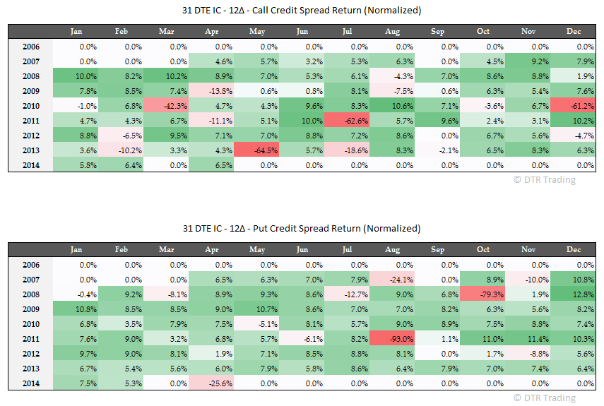
With the "no touch" 8 delta version, the call spreads lost 17 times since 2007, while the put spreads also lost 13 times.  The percentages are 20% and 15% respectively.  We can also compare the sum of all the losing percentages for the call spreads and put spreads separately.  For the 8 delta version, the sum of the negative returns for the calls was -203% versus -204% for the puts...about equal.  The total magnitude of the losing put trades was 1% greater.  The average loss for the losing call spreads was -12%, while the average loss for the losing put spreads was -16%.  The big losses on the put side occurred in the spring of 2008, the fall of 2008 and the late summer of 2011.


For the 12 delta version, the calls lost 17 times, while the puts lost 14 times.  20% and 16% respectively.  The sum of the negative returns for the calls was -320% versus -280% for the puts.  The calls contributed more to the total loses than the puts, and the call loses occurred more frequently.  The average loss for the losing call spreads was -19%, while the average loss for the losing put spreads was -20%...almost equal.


For the 16 delta version, the calls lost 20 times, while the puts lost 15 times.  23% and 17% respectively.  The sum of the negative returns for the calls was -445% versus -362% for the puts.  Again, the calls contributed more to the total loses than the puts, and the call loses occurred more frequently. The average loss for the losing call spreads was -22%, while the average loss for the losing put spreads was -24%.


For the 20 delta version, the calls lost 23 times, while the puts lost 18 times.  26% and 21% respectively.  The sum of the negative returns for the calls was -616% versus -479% for the puts.  The calls again contributed more to the total loses than the puts, and the call loses occurred more frequently.  The average loss for the losing call spreads was -27%, while the average loss for the losing put spreads was -27%...equal!


The call spreads lost more often than the put spreads.  The magnitude of the average loss for each put side loss was larger than the average loss for each call side loss...except for the 20 delta variation where they were equal.  The total losses on the call side were larger than the total losses on the put side (except for the 8 delta variation where they were about the same), and this difference grew larger as the size of the short delta increased.  Again, most of the losses in these trades in the last year and a half have occurred on the call side.

Sunday, June 22, 2014

24 Day RUT Iron Condor - 2013 / 2014 Performance

We have finally made it to the last condor in our test.  In this post, we will continue the mid level review of Iron Condors (IC).  This time we will turn our attention to the 24 days-to-expiration (DTE) RUT "no touch" ICs.  The original post is here:
We will begin by comparing the Summary Statistics of this strategy for the 2013 - 2014 period with the same statistics from the 2007 - 2014 and 2007 - 2012 periods.


The statistics for the last year and a half followed the trend that we observed in the 80 DTE, 66 DTE, 52 DTE, and 31 DTE versions of the IC strategy.  The statistics were worse for all delta variations of the 24 DTE trade during the last year and a half...except for the "worst trade" statistic.

As mentioned previously, the bars in green below represent the statistics from the period 2013 - 2014.  The AGR during the last year and a half from the 24 DTE RUT "no touch" IC, was lower (negative!) for all delta variations.

We see a smaller "best trade" during this recent period, for all delta variations.

A lower win rate currently, versus the past.

The standard deviation of returns was about the same during the last year and a half.  As noted in past posts, the greater the short strike delta, the greater the standard deviation of returns.

In case you are interested, here are the bar graphs for some of the other statistics of this strategy.


We will look at some other aspects of this 24 DTE strategy in the next post.

Friday, June 20, 2014

Trade P&L By Day In the 31 Day RUT Iron Condor

In the last two posts, I've shown two different approaches to looking at the performance of the 31 days-to-expiration (DTE)  RUT "no touch" iron condor (IC).

First, we looked at how the performance of the 31 DTE RUT "no touch" IC has deviated from the historical performance starting in 2013.  Second, we looked at the frequency, magnitude, and averages related to losses on the put credit spreads versus the call credit spreads.

In this post we will look at intra-trade performance.  In my first post on the 31 DTE RUT "no touch" IC, I showed the monthly performance heat map for all four delta variations of this strategy.  The heat map for the 8 delta variation is shown again below.  We will use this 8 delta variation, when reviewing intra-trade performance.


Each of the following equity curve charts corresponds to an expiration year.  The first graph shows a line for each 31 DTE RUT "no touch" IC trade with an expiration in 2007.  Each line in the chart shows the P&L by days-in-trade (DIT) for a particular trade.  Each trade is identified by its expiration month and year.  The x-axis is DIT, and the y-axis is P&L percent.  Scroll through the charts year by year and see how the behavior of this strategy evolved over the seven year period from 2007 through 2014.


P&L % versus DIT - 2007 Expiration Trades

P&L % versus DIT - 2008 Expiration Trades

P&L % versus DIT - 2009 Expiration Trades

P&L % versus DIT - 2010 Expiration Trades

P&L % versus DIT - 2011 Expiration Trades

P&L % versus DIT - 2012 Expiration Trades

P&L % versus DIT - 2013/2014 Expiration Trades

These charts add more qualitative information to the quantitative information contained in the Ulcer, Sharpe, and Sortino ratios.  We can see how the recent performance differs from the past very easily in these charts. 

The images for the 12, 16, and 20 delta variations of this trade have been uploaded to Google Drive.  A screenshot of all of the images, along with the 8 delta variation, is shown below.


You can download all 28 of these images from the Google Drive link below:

Thursday, June 19, 2014

Wing Comparison in the 31 Day RUT Iron Condor

In the last post, 31 Day RUT Iron Condor - 2013 / 2014 Performance, we looked at some of the statistics for the 31 days-to-expiration (DTE) RUT "no touch" Iron Condor (IC).  We noticed that the 8 delta variation of this trade performed about the same or better in the last year and a half than it did in the prior six year period (through 2012).  The opposite is the case for the other delta variations.  We have been in a different market for the last year and a half with trade performance deviating from past observations.

In this post we will review the performance of the 31 DTE RUT "no touch" IC's put credit spreads and call credit spreads independently.   The heat graphs below show the performance of the different delta variations of the strategy, with the performance of the call credit spreads shown separately from the performance of the put credit spreads for the same expiration date.

With the "no touch" 8 delta version, the call spreads lost 10 times since 2007, while the put spreads also lost 10 times.  The percentages are 11%.  We can also compare the sum of all the losing percentages for the call spreads and put spreads separately.  For the 8 delta version, the sum of the negative returns for the calls was -164% versus -190% for the puts.  The total magnitude of the losing put trades was larger.  The average loss for the losing call spreads was -16%, while the average loss for the losing put spreads was -19%.  The big losses on the put side occurred in fall of 2008 and the late summer of 2011.


For the 12 delta version, the calls lost 15 times, while the puts lost 11 times.  17% and 13% respectively.  The sum of the negative returns for the calls was -314% versus -273% for the puts.  The calls contributed more to the total loses than the puts, and the call loses occurred more frequently.  The average loss for the losing call spreads was -21%, while the average loss for the losing put spreads was -25%.


For the 16 delta version, the calls lost 18 times, while the puts lost 13 times.  21% and 15% respectively.  The sum of the negative returns for the calls was -480% versus -382% for the puts.  Again, the calls contributed more to the total loses than the puts, and the call loses occurred more frequently. The average loss for the losing call spreads was -27%, while the average loss for the losing put spreads was -29%.


For the 20 delta version, the calls lost 23 times, while the puts lost 15 times.  26% and 17% respectively.  The sum of the negative returns for the calls was -682% versus -519% for the puts.  The calls again contributed more to the total loses than the puts, and the call loses occurred more frequently.  The average loss for the losing call spreads was -30%, while the average loss for the losing put spreads was -35%.


The call spreads lost the same or more often than the put spreads.  The magnitude of the average loss for each put side loss was larger than the average loss for each call side loss for all delta variations.  The total losses on the call side were larger than the total losses on the put side (except for the 8 delta variation), and this difference grew larger as the size of the short delta increased.  Again, most of the losses in these trades in the last year and a half have occurred on the call side.

Wednesday, June 18, 2014

31 Day RUT Iron Condor - 2013 / 2014 Performance

In this post, we will continue the mid level review of Iron Condors (IC).  This time we will turn our attention to the 31 days-to-expiration (DTE) RUT "no touch" ICs.  The original post is here:
We will begin by comparing the Summary Statistics of this strategy for the 2013 - 2014 period with the same statistics from the 2007 - 2014 and 2007 - 2012 periods.


The statistics for the last year and a half mostly followed the trend that we observed in the 80 DTE, 66 DTE, and 52 DTE versions of the IC strategy.  The statistics were worse for all variations of the 31 DTE trade during the last year and a half, except for the 8 delta variation.

After reviewing the 80, 66, 52, and 38 DTE versions of this IC strategy, you should be getting pretty familiar with the graphical representations of the statistics that follow.  As mentioned previously, the bars in green below represent the statistics from the period 2013 - 2014.  The AGR during the last year and a half from the 31 DTE RUT "no touch" IC, was lower for all delta variations, except for the 8 delta variation, which was about equal.

We see a smaller "best trade" during this recent period, for all delta variations.

A smaller win rate currently, versus the past, except for the 8 delta variation which was again about equal.

The standard deviation of returns decreased during the last year and a half.  As noted in past posts, the greater the short strike delta, the greater the standard deviation of returns.

In case you are interested, here are the bar graphs for some of the other statistics of this strategy.


We will look at some other aspects of this 31 DTE strategy in the next post.

Tuesday, June 17, 2014

Trade P&L By Day In the 38 Day RUT Iron Condor

In the last two posts, I've shown two different approaches to looking at the performance of the 38 days-to-expiration (DTE)  RUT "no touch" iron condor (IC).

First, we looked at how the performance of the 38 DTE RUT "no touch" IC has deviated from the historical performance starting in 2013.  Second, we looked at the frequency, magnitude, and averages related to losses on the put credit spreads versus the call credit spreads.

In this post we will look at intra-trade performance.  In my first post on the 38 DTE RUT "no touch" IC, I showed the monthly performance heat map for all four delta versions of this strategy.  The heat map for the 8 delta version is shown again below.  We will use this 8 delta version, when reviewing intra-trade performance.


Each of the following equity curve charts corresponds to an expiration year.  The first graph shows a line for each 38 DTE RUT "no touch" IC trade with an expiration in 2007.  Each line in the chart shows the P&L by days-in-trade (DIT) for a particular trade.  Each trade is identified by its expiration month and year.  The x-axis is DIT, and the y-axis is P&L percent.  Scroll through the charts year by year and see how the behavior of this strategy evolved over the seven year period from 2007 through 2014.


P&L % versus DIT - 2007 Expiration Trades

P&L % versus DIT - 2008 Expiration Trades

P&L % versus DIT - 2009 Expiration Trades

P&L % versus DIT - 2010 Expiration Trades

P&L % versus DIT - 2011 Expiration Trades

P&L % versus DIT - 2012 Expiration Trades

P&L % versus DIT - 2013/2014 Expiration Trades

These charts add more qualitative information to the quantitative information contained in the Ulcer, Sharpe, and Sortino ratios.  We can see how the recent performance differs from the past very easily in these charts. 

The images for the 12, 16, and 20 delta versions of this trade have been uploaded to Google Drive.  A screenshot of all of the images, along with the 8 delta versions, is shown below.


You can download all 28 of these images from the Google Drive link below: