CustomMenu

Tuesday, December 12, 2017

Iron Condor Results Summary - Part 6 - IC Returns vs Initial Conditions Correlation

In the last article, we looked at correlations between Iron Condor returns and Iron Condor structures / trade management. Specifically, we started with the following list of areas to investigate:

  1. Correlation between Iron Condor strategy structure / management and result metrics
  2. Which result metrics most influence equity curve shape
  3. Correlation between result metrics
  4. Correlation between initial trade conditions and trade outcome based on strategy variation

In the last article we looked at items 1 and 2, and in this article we will look at items 3 and 4. We will start with the correlation between result metrics. For reviewing the correlation numbers, I'll use the following guidelines:

  • -0.5 to -1.0 or +0.5 to +1.0: strong correlation
  • -0.3 to -0.5 or +0.3 to + 0.5: moderate correlation
  • -0.1 to -0.3 or +0.1 to +0.3: weak correlation
  • -0.1 to +0.1: no correlation

While there is not 100% agreement on these levels across experts, these levels are fairly close to the common ranges listed in a number of statistics articles and books.


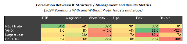
3. Correlation Between Result Metrics
The correlation matrices below show the results for all 3024 strategy variations, and also the subset of 1512 strategy variations that just contain profit targets and stops. There isn't any surprising information in these two matrices. The strong correlations in the tables are exactly where you would expect strong correlations to exist.

(click to enlarge)
(click to enlarge)


4. Correlation Between Initial Trade Conditions and Returns
This is the most interesting topic. I've analyzed if there is any relationship between the conditions at trade entry and the P&L for a trade. For initial conditions, I used the following indicator values from the day a trade was initiated:

  • IV Correlation: average implied volatility (IV) of the at the money (ATM) call and put
  • VIX Correlation: VIX
  • Skew 10: skew calculation based on 10 delta and 50 delta calls and puts (see note below)
  • Skew 25: skew calculation based on 25 delta and 50 delta calls and puts (see note below)
  • Skew 40: skew calculation based on 40 delta and 50 delta calls and puts (see note below)
  • Put Slope: indicator based on IV of 10 puts at various deltas (8, 12, 16, 20, 25, 30, ... , 50)
  • Slope(50-12): indicator based on slope of IVs at 12 delta and 50 delta
  • Slope(50-30): indicator based on slope of IVs at 30 delta and 50 delta
  • Credit: credit received per trade
  • Above/Below MA(50): whether the SPX is above/below it's MA(50) (-1, 0, +1)
  • Above/Below MA(200): whether the SPX is above/below it's MA(200) (-1, 0, +1)
  • ATR-50: indicator based on the number of ATRs the SPX is above/below it's MA(50)
  • ATR-200: indicator based on the number of ATRs the SPX is above/below it's MA(200)
Note: skew calculation based on Mixon paper: What Does Implied Volatility Skew Measure?

The 25th percentile, mean, and 75th percentile values for each of these indicators at 80 DTE is displayed in the table below. This will give you an idea of the distribution of the indicator values between January, 2007 and September, 2016.

(click to enlarge)

The correlation between returns and these indicators is shown in correlation tables below. Each table is for a specific DTE, short strike delta, wing width, stop loss, and profit target. Each table also includes the three Iron Condor starting structures (DN - delta neutral, EL - extra long put, and ST - standard balanced). Each row corresponds to a particular wing width, and each column corresponds to a particular stop loss level. My biggest take away was that there was either weak correlation or no correlation between indicator values at trade initiation and the final trade results.

The nine correlation tables below are for the 80 DTE Iron Condor variations with 8 delta short strikes. Across these tables, there were only 11 values of 0.2 / 20% or greater. 7 of these values occurred with the DN structure. 4 of these 11 values were associated with the VIX. Overall, though, any correlation of returns with initial conditions was weak for these trade variations.

(click to enlarge)

The nine correlation tables below are for the 80 DTE Iron Condor variations with 12 delta short strikes. Across these tables, there were only 41 values of 0.2 / 20% or greater. A much larger number than for the variations with 8 delta short strikes. 17 of these values occurred with the EL structure, 15 with the ST structure. 14 of these 41 values were associated with the Slope(50-12) indicator, and 10 with the Credit. Again, overall, any correlation of returns with initial conditions was weak for these trade variations.

(click to enlarge)

For the sake of completeness, the indicator values and correlations at 66 DTE are included below. There are six correlation tables for the 66 DTE Iron Condor variations with 12 delta short strikes. Across these tables, there were only 21 values of 0.2 / 20% or greater. 9 of these values occurred with the ST structure. 10 of these 21 values were associated with the Skew 40 indicator, and 6 with the ATR-50 indicator. Incidentally, the Skew 40 indicator also had one correlation value that hit 0.3. Regardless, any correlation of returns with initial conditions was also weak for these trade variations.

(click to enlarge)
(click to enlarge)

I think the big take away from this correlation analysis is that the market conditions at trade initiation, specifically indicator readings, have almost no ability to predict the final returns for these Iron Condors. So, don't overthink your entries.

I'm still reflecting on a quote from Euan Sinclair on the Talton Capital Management blog and how it relates to these results:
"always use the simplest method possible. Trading is a business. Problems are to be solved, not treated as sources of amusement or intellectual challenges. Brute force is often a perfectly acceptable technique."
I think the correlation results for these simple Iron Condors fall under the category of "brute force is often a perfectly acceptable technique." Decent results are possible with static profit targets and static stop loss levels. Spend your time managing your trades, not overthinking your entries.


Follow my blog by email, RSS feed or Twitter (@DTRTrading).  All options are available on the top of the right hand navigation column under the headings "Subscribe To RSS Feed", "Follow By Email", and "Twitter"

Wednesday, December 6, 2017

Iron Condor Results Summary - Part 5 - IC Structure vs Metrics Correlation

In the last article, posted way back in August, I looked at the Iron Condor structures that appeared to perform the best for each of the seven metrics I tracked. Recall that I tested 3024 different Iron Condor strategy variations over the period from January 2007 through September 2016. This testing generated more than 600,000 Iron Condor trades. The past articles can be found at:


Background
After writing those four articles, I was a bit disappointed with the results. In Part 3, I looked at three strategy variations that appeared to be some of the strongest based on the results in Part 1 and Part 2. These variations did not have the equity curves that I was anticipating. In Part 4, I ranked the 3024 different Iron Condor strategy variations by seven metrics in order to create a composite rank for each of variation. I then looked at the top scoring variation for each of the seven metrics, while also noting that variation's composite rank. These top performing strategy variations were a bit disappointing as well.

My next step was to identify four "families" of Iron Condor strategies that had some of the best composite rank scores. Those Iron Condor "families" included:

  • 80 DTE, 25 point wings, 8 delta short strikes
  • 80 DTE, 25 point wings, 12 delta short strikes
  • 80 DTE, 50 point wings, 16 delta short strikes
  • 66 DTE, 25 point wings, 12 delta short strikes

For these "families" I looked at all of the combinations of profit targets, and stop loss for each of the different starting structures (DN, EL, ST). I tweeted the results from this analysis starting September 16 and running through October 11. Quite a few of these variations looked promising.


Correlations
Since that time, I've been looking more closely at a number of features related to the result metrics, including:

  1. Correlation between Iron Condor strategy structure / management and result metrics
  2. Which result metrics most influence equity curve shape
  3. Correlation between result metrics
  4. Correlation between initial trade conditions and trade outcome based on strategy variation


1. Correlation Between Iron Condor Structure and Metrics
Let's take a quick look at the results from bullet one above, the correlation between Iron Condor strategy structure / management and result metrics. The correlation matrices below show the results for all 3024 strategy variations, and also the subset of 1512 strategy variations that just contain profit targets and stops.

(click to enlarge)
(click to enlarge)

A few points to note from the correlation matrices:

  • P&L / Trade vs DTE:
    The trades entered at higher DTE (i..e 80), generated greater returns per trade. You'd expect this, since we have more days of theta generation. Assuming we have two variations, with the only difference being DTE, you'd expect the higher DTE trade to generate a greater return since its DIT will typically be greater.

  • P&L / Trade vs Short Delta:
    Higher delta short strikes generate greater returns per trade than lower delta short strikes. For example, a variation with 20 delta short strikes will typically generate greater P&L / trade than a similar variation with 8 delta short strikes.

  • P&L / Trade vs Risk (stop loss):
  • Trades managed with larger risk / stops (i.e. 300% or NA) generated greater returns per trade than those managed with lower risk. With larger stops, you give the market more "room to run" inside the structure of the Iron Condor.

  • Win % vs Short Delta:
  • As the delta of the short strike decreases, Win % increases. For example, a variation with an 8 delta short strike would tend to have a higher win rate than a similar variation with a 12 delta short strike.

  • Win % vs Risk (stop loss):
  • The Win % is strongly correlated with Risk / stop level. Higher stop loss levels (i.e. 300% or NA) are associated with higher Win % numbers.

  • Win % vs Reward (profit target):
  • The Win % is negatively correlated with Reward / profit target. Variations with lower profit targets (i.e. 50%) have higher Win % numbers than variations with higher profit targets.

  • Largest Loss vs Wing Width:
  • This one is less obvious due to the way I measured Largest Loss. The larger the Wing Width, the smaller the Largest Loss. Fore example, a variation with a Wing Width of 75 would tend to have smaller losses (in terms of % of max risk) than a similar variation with 25 point wings.

  • Largest Loss vs Short Delta:
  • Again, this is less obvious due to the way I recorded Largest Loss. The larger the Short Delta, the larger the Largest Loss. A variation with short strikes at 8 delta would tend to have smaller losses (in terms of % of max risk) than a similar variation with short strikes at 20 delta.

  • Largest Loss vs Risk (stop loss):
  • The larger the Risk / stop loss, the larger the Largest Loss. For example, a variation with a 300% stop would tend to have larger losses than a similar variation with a 100% stop loss.

  • P&L / Day vs Short Delta:
  • The smaller the short strike delta, the smaller the P&L per Day. For example, a variation with short deltas at 8 would then to generate less profit per day than a similar variation with shorts at 20 delta.

  • P&L / Day vs Reward (profit target):
  • The lower the Reward / profit target, the higher the P&L per Day. For example, a variation with a profit target of 50% would tend to generate more profit per day than a similar variation with a profit target of 75%.

I'm not sure there is anything too surprising in the above correlations. Most of us would have assumed that these relationships existed, but it's nice to quantify the correlations. Also note what did not show much of a correlation:

  • DTE: no significant correlation with Win%, Largest Loss, or P&L / Day
  • Wing Width: no significant correlation with P&L / Trade, Win %, or P&L / Day
  • Type: very minimal correlation between P&L / Day and the ST initial starting structure
  • Risk (stop loss): minimal correlation between P&L / Day and stop loss level, with a larger stop generating slightly more P&L / day
  • Reward (profit target): no significant correlation with P&L / Trade, or Largest Loss


2. Metrics Influencing Equity Curve Shape
Now let's move on to bullet 2 in the list above...the result metrics that most influence equity curve shape. This again shouldn't be a big surprise. A variation with a high Win % and low Largest Loss will have the smoothest equity curve. A variation with a low Win % will be more "jagged", with the size of the drops being related to the Largest Loss number.

Let's now find some examples of variations with smooth equity curves. We need variations with a high Win% and low Largest Loss number.

A high Win % is correlated with low deltas, high risk / stops, and low reward / profit targets. An example would be an Iron Condor with 8 delta shorts, a stop at 300% or NA, and a profit target of 50%.

A small Largest Loss number is correlated with large wing widths, low deltas, and low risk / stops. The last one is at odds with our Win % requirements. An example of a variation that meets this requirement would be an Iron Condor with 75 point wings, 8 delta shorts, and a stop at 100%.

For the smoothest equity curve, we should be looking at Iron Condors with 50 to 75 point wings, 8 to 12 delta shorts, stops in the 200% to 300% range, and a profit target of 50%.

We'll look at bullets three, and possibly four, in the next article. Also, my plan is to try to close out this Iron Condor series by the end of the year, and move on to other analysis...if all goes well.


Follow my blog by email, RSS feed or Twitter (@DTRTrading).  All options are available on the top of the right hand navigation column under the headings "Subscribe To RSS Feed", "Follow By Email", and "Twitter"

Sunday, October 29, 2017

Broken Wing Butterfly Price and Volatility - CDN

In the last two posts (RTT and 60/40/20), we looked at how implied volatility (IV) and price of the option strikes in two broken wing butterfly (BWB) strategies changed with time. In this post, we'll look at another BWB strategy, the centered delta neutral (CDN) BWB. In this strategy, the short put options are at-the-money (ATM), the lower long is at least 100 points below the market, and the upper long is positioned to create a delta neutral structure. An SPX January 2018 expiration CDN is modeled below.

(click to enlarge)

As in the last two articles, we'll use five option chains in our analysis. The options chains we'll use expire on:
  • 03-Nov-2017 (7 DTE)
  • 10-Nov-2017 (14 DTE)
  • 17-Nov-2017 (20 DTE)
  • 15-Dec-2017 (48 DTE)
  • 19-Jan-2018 (83 DTE)
In the chart below, these five SPX options chains are plotted in terms of IV. In addition, the three strikes of our CDN along with the current market are marked with vertical lines.

(click to enlarge)

If the market conditions don't change, what can we expect? As time progresses in this trade, we expect the IV of the lower long ("Long 1" - blue vertical line) to increase from approximately 12.5% to 16+%. Notice how the different expirations move up the blue vertical line ("Long 1") as DTE decrease. The center strike ("Short" - red vertical line), behaves differently, with the IV dropping from approximately 9% to about 6%. The IV of the upper long ("Long 2") behaves similar to "Long 1" and increases from approximately 8% to about 12%.

So what happens with the price of these put options as DTE decrease? They all lose value with time...not a surprise! The options at-the-money (ATM) lose the most...again, not a surprise. The upper longs in-the-money (ITM) lose the least. Similar to the IV chart above, the strikes of our CDN along with the current market price are marked with vertical lines.

(click to enlarge)

As we did with the last two BWB strategies, we'll use the Black-Scholes model to simulate how the prices of our CDN strikes change with DTE. For a given strike, we use the actual IVs from our options chains as inputs to the Black-Scholes model.

For the lower long strike of our CDN, the 2470 strike, we have IVs at 7 DTE, 14 DTE, 20 DTE, 48 DTE, and 83 DTE. At 83 DTE the IV of the 2470 strike is 12.6%, and at 7 DTE the IV of the 2470 strike is 16.1%. The chart below shows how the price of the 2470 strike decays with variable IV (changing from 12.6% to 16.1%), with fixed IV of 12.6%, and with fixed IV of 16.1%. The variable IV (purple line) is closer to how this option price will actually decay.

(click to enlarge)

The theoretical decay of the center short strike is shown in the chart below.

(click to enlarge)

Finally, the theoretical decay of the upper long strike is shown in the next chart.

(click to enlarge)

In ThinkOrSwim (TOS), using four 20 day steps, we can see how the price of the CDN changes with time. This is shown in the image below. We can see that if the market did not move, and if the IV stayed constant, we would expect the price to increase to expiration.

(click to enlarge)

Using the theoretical Black-Scholes option prices from the analysis above, we can model the CDN price by DTE. Assuming the market and IV remain constant, the Black-Scholes model shows the CDN price change by DTE in the chart below.

(click to enlarge)

Neither the TOS Bjerksund-Stensland model nor the Black-Scholes model reflect what will actually happen with this trade, even if both the SPX and IV remained constant. These models do provide a view of the general trend of price change with DTE, which can be useful when evaluating your actual trades.

This is all for now for BWB, but in the future we'll look more at how initial conditions impact the outcome of these trades.


Follow my blog by email, RSS feed or Twitter (@DTRTrading).  All options are available on the top of the right hand navigation column under the headings "Subscribe To RSS Feed", "Follow By Email", and "Twitter"

Broken Wing Butterfly Price and Volatility - 60/40/20

In the last post, we looked at how the implied volatility (IV) and price of the option strikes in Road Trip Trade (RTT) changed with time. In this post, we'll look at another broken wing butterfly (BWB) strategy, the 60/40/20 BWB. In this strategy, the put options are at 60 delta, 40 delta, and 20 delta. An SPX January 2018 expiration 60/40/20 is modeled below.

(click to enlarge)

As in the last article, we'll use five option chains in our analysis. The options chains we'll use expire on:
  • 03-Nov-2017 (7 DTE)
  • 10-Nov-2017 (14 DTE)
  • 17-Nov-2017 (20 DTE)
  • 15-Dec-2017 (48 DTE)
  • 19-Jan-2018 (83 DTE)
In the chart below, these five SPX options chains are plotted in terms of IV. In addition, the three strikes of our 60/40/20 along with the current market are marked with vertical lines.

(click to enlarge)

If the market conditions don't change, what can we expect? As time progresses in this trade, we expect the IV of the lower long ("Long 1" - blue vertical line) to increase from approximately 13% to 18+%. Notice how the different expirations move up the blue vertical line ("Long 1") as DTE decrease. The center strike ("Short" - red vertical line), behaves differently, with the IV dropping from approximately 10% to about 8%. The IV of the upper long ("Long 2") first drops from about 8.5% to approximately 7.5%, then increases back to about 8.5%.

So what happens with the price of these put options as DTE decrease? They all lose value with time...not a surprise! The options closer to at-the-money (ATM) lose the most...again, not a surprise. Similar to the IV chart above, the strikes of our 60/40/20 along with the current market price are marked with vertical lines.

(click to enlarge)

As we did with the RTT BWB, we'll use the Black-Scholes model to simulate how the prices of our 60/40/20 strikes change with DTE. For a given strike, we use the actual IVs from our options chains as inputs to the Black-Scholes model.

For the lower long strike of our 60/40/20, the 2450 strike, we have IVs at 7 DTE, 14 DTE, 20 DTE, 48 DTE, and 83 DTE. At 83 DTE the IV of the 2450 strike is 13.3%, and at 7 DTE the IV of the 2450 strike is 18.3%. The chart below shows how the price of the 2450 strike decays with variable IV (changing from 13.3% to 18.3%), with fixed IV of 13.3%, and with fixed IV of 18.3%. The variable IV (purple line) is closer to how this option price will actually decay.

(click to enlarge)

The theoretical decay of the center short strike is shown in the chart below.

(click to enlarge)

Finally, the theoretical decay of the upper long strike is shown in the next chart.

(click to enlarge)

So, how do we expect the price of the entire 60/40/20 to evolve with time? This is shown in ThinkOrSwim (TOS), using four 20 day steps, in the image below. We can see that if the market did not move, and if the IV stayed constant, we would expect the price to increase to expiration. If the market were to drop closer to our center short strike, the profit potential of this trade would increase.

(click to enlarge)

Using the theoretical Black-Scholes option prices from the analysis above, we can model the 60/40/20 price by DTE. Assuming the market and IV remain constant, the Black-Scholes model shows the 60/40/20 price change by DTE in the chart below.

(click to enlarge)

As mentioned in the last article, neither the TOS model or the Black-Scholes model reflect what will actually happen with this trade, even if both the SPX and IV remained constant. These models do provide a view of the general trend of price change with DTE, which can be useful when evaluating your actual trades.

I'll run through a similar analysis of one more BWB structure in the next day or so, before finally finishing up with the Iron Condor backtest analysis.


Follow my blog by email, RSS feed or Twitter (@DTRTrading).  All options are available on the top of the right hand navigation column under the headings "Subscribe To RSS Feed", "Follow By Email", and "Twitter"

Broken Wing Butterfly Price and Volatility - RTT

With SPX implied volatility (IV) so low for months now, and with a strong up trending market, butterflies have been challenging to trade. About the only variations that have been able to withstand both the low IV and uptrend have been broken wing butterflies (BWB). One BWB variation, the Road Trip Trade (RTT) has been reasonably good at handling this market. An SPX January 2018 expiration RTT is modeled below.

(click to enlarge)

Let's look at the options associated with this trade a little more closely. We have several SPX option chains expiring prior to January 2018. We'll choose five to keep the analysis less complicated. The options chains we'll use in our analysis expire on:
  • 03-Nov-2017 (7 DTE)
  • 10-Nov-2017 (14 DTE)
  • 17-Nov-2017 (20 DTE)
  • 15-Dec-2017 (48 DTE)
  • 19-Jan-2018 (83 DTE)
In the chart below, these five SPX options chains are plotted in terms of IV. In addition, the three strikes of our RTT along with the current market are marked with vertical lines.

(click to enlarge)

If the market conditions don't change, what can we expect? As time progresses in this trade, we expect the IV of the lower long ("Long 1" - blue vertical line) to increase from approximately 14% to 20+%. Notice how the different expirations move up the blue vertical line ("Long 1") as DTE decrease. We expect the same to occur at the center strike ("Short" - red vertical line), but with a smaller change from approximately 12% to 14+%. The upper long ("Long 2") will change even less, with the IV first dropping before increasing slightly.

If the VIX were to increase, the IV behavior outlined above would remain essentially the same. The magnitudes would change though as the slopes of these IV lines would change.

If the market were to move up, only the behavior of the upper long would change. Rather than the IV of the upper long dropping and then increasing, it would just increase.

If the market were to move up by say 20 points, we can estimate the associated IV change by strike. We can do this by shifting the RTT strikes in the chart down by 20 points. So, 2430 would go down to 2410, and we can see that if the market did not move up any further, the IV of this strike would then change from approximately 14.5% to 22+%. In a similar fashion, we can estimate the IV change of the other two strikes if the market were to move up.

Now, what do these IV changes tell us about the prices of our put options? Well, they all lose value with time...not a surprise! The options closer to at-the-money (ATM) lose the most...again, not a surprise. Similar to the IV chart above, the strikes of our RTT along with the current market price are marked with vertical lines.

(click to enlarge)

Using the Black-Scholes model we can simulate how the put prices of our RTT strikes will change with DTE. For a given strike, we can use the actual IVs from our options chains as inputs to the Black-Scholes model.

For the lower long strike of our RTT, the 2430 strike, we have IVs at 7 DTE, 14 DTE, 20 DTE, 48 DTE, and 83 DTE. At 83 DTE the IV of the 2430 strike is 13.9%, and at 7 DTE the IV of the 2430 strike is 20.0%. The chart below shows how the price of the 2430 strike decays with variable IV (changing from 13.9% to 20.0%), with fixed IV of 13.9%, and with fixed IV of 20.0%. The variable IV (purple line) is closer to how this option price will actually decay.

(click to enlarge)

The theoretical decay of the center short strike is shown in the chart below.

(click to enlarge)

Finally, the theoretical decay of the upper long strike is shown in the next chart.

(click to enlarge)

So, how do we expect the price of the entire RTT to evolve with time? This is shown in ThinkOrSwim (TOS), using four 20 day steps, in the image below. We can see that if the market did not move, and if the IV stayed constant, we would expect the price to increase through December (gray line), before finally dropping in value into expiration (yellow line). If the market were to drop closer to our center short strike, the profit potential of this trade would clearly increase.

(click to enlarge)

Using the theoretical Black-Scholes option prices from the analysis above, we can model the RTT price by DTE. Assuming the market and IV remain constant, the Black-Scholes model shows the RTT price change by DTE in the chart below.

(click to enlarge)

Neither the TOS model or the Black-Scholes model reflect what will actually happen with this trade, even if both the SPX and IV remained constant. These models do provide a view of the general trend of price change with DTE, which can be useful when evaluating your actual trades.

I'll run through a similar analysis of two more BWB structures in the next few days, before finally finishing up with the Iron Condor backtest analysis.


Follow my blog by email, RSS feed or Twitter (@DTRTrading).  All options are available on the top of the right hand navigation column under the headings "Subscribe To RSS Feed", "Follow By Email", and "Twitter"

Tuesday, August 29, 2017

Iron Condor Results Summary - Part 4 - Top Performers By Metric

In this article we will look at a subset of the 3024 iron condor strategy variations that were tested between January 2007 and September 2016. Specifically, we will look at the 1512 iron condor strategy variations that used both stop losses and profit targets. Out of these 1512 variations we will look at the top performers in terms of the following metrics:
  1. P&L / Trade (total return)
  2. Largest Loss % (looking for the smallest value)
  3. P&L / Day
  4. Win Rate
  5. Profit Factor
  6. Sortino Ratio
  7. Shortest time in trade for winning trades (in terms of % of DTE)

The top scoring iron condor strategy variations for each of these seven categories are listed below. For each metric, the metric value is listed first, followed by the details of the iron condor strategy variation that generated that value, followed by win rates, and finally the strategy score as described in the last article here.
  1. P&L / Trade (9.1%): 
    • 80 DTE
    • ST structure
    • 50 pt. wings
    • 20 delta shorts 
    • 300% stop loss / 75% profit taking
    • 2007 - 2016 win rate: 79%
    • 2016 - 2017 win rate: 75%
    • Strategy score: 67
  2. Largest Loss % (-11%): 
    • 66 DTE
    • DN structure
    • 75 pt. wings
    • 8 delta shorts
    • 100% stop loss / 50% profit taking
    • 2007 - 2016 win rate: 82%
    • 2016 - 2017 win rate: 92%
    • Strategy score: 72
  3. P&L / Day (0.18%): 
    • 45 DTE
    • DN structure
    • 25 pt. wings
    • 20 delta shorts
    • 300% stop loss / 50% profit taking
    • 2007 - 2016 win rate: 86%
    • 2016 - 2017 win rate: 75%
    • Strategy score: 74
  4. Win Rate (96%): 
    • 80 DTE
    • ST structure
    • 25 pt. wings
    • 8 delta shorts
    • 300% stop loss / 50% profit taking
    • 2007 - 2016 win rate: 96%
    • 2016 - 2017 win rate: 83%
    • Strategy score: 90
  5. Profit Factor (4.5%): 
    • 80 DTE
    • ST structure
    • 25 pt. wings
    • 8 delta shorts
    • 300% stop loss / 50% profit taking
    • 2007 - 2016 win rate: 96%
    • 2016 - 2017 win rate: 83%
    • Strategy score: 90
  6. Sortino Ratio (0.25): 
    • 80 DTE
    • DN structure
    • 50 pt. wings
    • 8 delta shorts
    • 100% stop loss / 75% profit taking
    • 2007 - 2016 win rate: 77%
    • 2016 - 2017 win rate: 75%
    • Strategy score: 69
  7. %DTE (30%): 
    • 80 DTE
    • EL structure
    • 25 pt. wings
    • 8 delta shorts
    • 100% stop loss / 50% profit taking
    • 2007 - 2016 win rate: 79%
    • 2016 - 2017 win rate: 67%
    • Strategy score: 74

Out of these seven iron condor strategy variations, there was one duplicate...the strategy that generated the top win rate was also the strategy that generated the top profit factor. Now, lets look at the equity curves for these six strategy variations. Note, for reference, an SPX chart is included below the equity curve chart.

(click to enlarge)
(click to enlarge)

The two iron condor strategy variations using 20 delta short strikes had the highest returns, but also the least smooth equity curves. The strategy variation with the highest win rate, had the third highest returns on this chart, but has been under performing in 2017.

The return distribution for these monthly trades for the initial test range (January 2007 through September 2016) is shown in the table below.

(click to enlarge)

The strategy variation with the shortest time in trade, also had the smallest absolute loss, but not the smallest loss as a percentage of capital at risk. This table doesn't provide any new information, but does provide some data driving the shapes of the equity curves shown above.

Now let's take a look at the returns for the one year period running from July 2016 expiration through the June 2017 expiration.

(click to enlarge)

During this recent one year period, the win rates and returns for these iron condor strategy variations (except for one!) have lagged their historical averages.

The one strategy variation that bucked this under performance trend was the one with the smallest "Largest Loss" number...the 66 DTE, DN structure, 75 pt. wing, 8 delta short iron condor with a 100% stop loss and a 50% profit taking level. This strategy had a 25.2% return during this most recent one year test period, with a win rate of 92%. Historically, this strategy returned 18% per year, with a win rate of 82%. Note, this is the strategy with the solid red equity curve above.

The other strategy variation that was closest to it's historical metrics was the one with the highest Sortino Ratio...the 80 DTE, DN structure, 50 pt. wing, 8 delta short iron condor with a 100% stop loss and a 75% profit taking level. This strategy had a 20.1% return during this most recent one year test period, with a win rate of 75%. Historically, this strategy returned 32% per year, with a win rate of 77%. Note, this is the strategy with the red dashed equity curve above.

The two better preforming strategy variations during this recent one year period were both delta neutral (DN) structures.

In the next article, we'll look at a few of the higher scoring iron condors. These tended to be initiated at 80 DTE, with short strike deltas at either 8 or 12.


Follow my blog by email, RSS feed or Twitter (@DTRTrading).  All options are available on the top of the right hand navigation column under the headings "Subscribe To RSS Feed", "Follow By Email", and "Twitter"

Monday, August 7, 2017

Iron Condor Results Summary - Part 3 - 2017 Results

In this article we'll look more deeply at the following iron condor (IC) strategy variations:
  1. 38 DTE, 25 pt. wings, 20 delta shorts, 100% stop loss, 50% profit taking
  2. 80 DTE, 25 pt. wings, 20 delta shorts, 100% stop loss, 50% profit taking
  3. 80 DTE, 75 pt. wings, 12 delta shorts, 200% stop loss, 50% profit taking
These strategy variations appeared to be the strongest based on their metrics, and the stability of their metrics. A summary of all of the articles in this series can be found here.

Recall, that in this series of IC articles we looked at three different starting structures (see introduction):
  1. Standard (ST): equal number of call spreads and put spreads
  2. Delta Neutral (DN): fewer call spreads than put spreads ... can better withstand up moves
  3. Extra Long Put (EL): same as ST, but with one extra long put ... can better withstand down moves
In the sections below, we'll look at how these three structures (ST, DN, EL) perform relative to each other in each of the three strategy variations listed at the top of this page.

Lastly, in the prior articles in this series, I  used data from trades running from the January 2007 expiration through the September 2016 expiration.  In this article I have expanded the results to include trades from the January 2007 expiration through the June 2017 expiration.


IC Strategy 1  (38 DTE, 25 pt. wings, 20 delta shorts, 100% stop loss, 50% profit taking)

The equity curves for the three structures, executing trades only using the monthly options, are shown below.

(click to enlarge)

The equity curves for the standard (ST) and delta neutral (DN) look better than the extra long put structure, with the DN looking the best. Neither the DN or ST structures really started performing well until January 2012. Overall, these equity curves at 38 DTE are pretty jagged.

The returns for each of these structures over the last 12 months of backtests are shown in the tables below.

(click to enlarge)
(click to enlarge)
(click to enlarge)

The July 2016 expiration hit the DN and ST structures pretty hard, but the EL structure made money during that expiration. The V bottom at the end of June triggered stop loss exits on the DN and ST structures.

The December 2016 expiration was the next losing trade, with upside stop losses being triggered (DN 8-Dec-2016, EL 25-Nov-2016, ST 7-Dec-2016). The smallest loss on this expiration occurred with the EL structure.

The March 2017 expiration was again the result of upside stop losses being triggered (DN 23-Feb-2017, EL 15-Feb-2017, ST 15-Feb-2017). The smallest loss on this expiration occurred with the DN structured.

The highest total returns for this 12 month period were associated with the EL structure, with second place going to the ST structure.

The metrics for each of the three structures are shown in the table below. There are three major groupings in this table, with each grouping containing the results for a specific structure (DN, EL, ST). For each structure, there are three rows of metrics organized as follows:
  1. First row - results from trades on weekly expirations from Jan 2007 through Sep 2016
  2. Second row - results from trades on weekly expirations from Jan 2007 through June 2017
  3. Third row - results from trades on monthly expirations from Jan 2007 through June 2017
(click to enlarge)

In general, the metrics are pretty stable across the different time periods and frequencies. Metrics for the last 12 months were:
  1. DN - win rate: 75%; average p&l/trade: 1.3%
  2. EL - win rate: 83%; average p&l/trade: 6.3%
  3. ST - win rate: 75%; average p&l/trade: 3.5%


IC Strategy 2  (80 DTE, 25 pt. wings, 20 delta shorts, 100% stop loss, 50% profit taking)

The equity curves for the three structures, executing trades only using the monthly options, are shown below.

(click to enlarge)

None of these equity curves look great, but the DN equity curve looks the best and has been in an uptrend since March 2009. As with the 38 DTE strategies presented first, these 80 DTE variations have fairly jagged equity curves.

The returns for each of these structures over the last 12 months of backtests are shown in the tables below.

(click to enlarge)
(click to enlarge)
(click to enlarge)

The trade on the September 2016 expiration was a loser for both the EL and ST structures. Upside stop losses were triggered on these trades on 8-Jul-2016 and 18-Jul-2016 respectively.

The January 2017 expiration was a loser across all three structures. Upside stop losses were triggered on all of these structures on the following dates: 1) DN 6-Jan-2017, 2) EL 21-Nov-2016, and 3) ST 7-Dec-2016.

The February 2017 expiration was a loser for the EL and ST structures. Upside stop losses were triggered on these trades on 13-Dec-2016 and 10-Feb-2017 respectively.

The last losing trades occurred on the April 2017 expiration for both the EL and ST structures. Upside stop losses were triggered on these trades on 15-Feb-2017 and 24-Feb-2017 respectively.

All of the losses on these 80 DTE trades occurred due to upside moves. Not surprisingly, the DN structure performed the best during the last year since it better handles upside moves.

The metrics for each of the three structures are shown in the table below. As mentioned above, this table first groups the metrics by structure (DN, EL, ST), and then by time period / frequency.

(click to enlarge)

The metrics for the DN and EL structures were fairly consistent across time periods and frequency. The ST structure was not as stable, specifically with its P&L/trade numbers. The Jan-2007 through Sep-2016 period had the highest returns, and these return numbers dropped significantly when the period was expanded to Jan-2007 through Jun-2017. Trading this structure on a monthly cycle reduced the per trade returns even more. Metrics for the last 12 months were:
  1. DN - win rate: 92%; average p&l/trade: 9.2%
  2. EL - win rate: 67%; average p&l/trade: 0.4%
  3. ST - win rate: 67%; average p&l/trade: 0.4%


IC Strategy 3  (80 DTE, 75 pt. wings, 12 delta shorts, 200% stop loss, 50% profit taking)

The equity curves for the three structures, executing trades only using the monthly options, are shown below.

(click to enlarge)

With the lower delta short strikes and larger stop loss, the equity curves for this family of strategies were generally smoother than the prior two families of strategies.  The equity curve for the DN structure appears to be the most consistent, but the curves for all of these structures have been flat to down for the last two years.

The returns for each of these structures over the last 12 months of backtests are shown in the tables below.

(click to enlarge)
(click to enlarge)
(click to enlarge)

The first losing trades occurred with the September 2016 expiration for the EL and ST structures. Upside stop losses were triggered on 14-Jul-2016, and 20-Jul-2016 respectively. This was a losing month with the other 80 DTE strategy for these structures as well.

The January 2017 expiration trades were losers for all three structures. Upside stop losses were triggered for all three structures: 1) DN 13-Dec-2016, 2) EL 8-Dec-2016, and 3) ST 9-Dec-2016.

The last losing trades occurred with the April 2017 expiration and were the result of upside stop losses being hit on the EL and ST structures. Both of these trades were exited on 1-Mar-2017.

All of the losses for these 80 DTE trades were again due to upside moves. The DN structure was the clear winner with the other two structures having negative returns for the last 12 month period.

(click to enlarge)

The metrics for the DN structure was fairly consistent across time periods and frequency. The EL and ST structures were not as stable, specifically with their P&L/trade numbers. The Jan-2007 through Sep-2016 period had the highest returns, and these return numbers dropped when the period was expanded to Jan-2007 through June-2017. Trading this structure on a monthly cycle reduced the per trade returns even more. Metrics for the last 12 months were:
  1. DN - win rate: 92%; average p&l/trade: 3.0%
  2. EL - win rate: 75%; average p&l/trade: -2.7%
  3. ST - win rate: 75%; average p&l/trade: -2.8%


Summary

I didn't really like the performance of these three families of strategies, and was a bit disappointed with their equity curves. After looking at this data, I decided to look at all 3024 strategy variations again and rank them.

I created a composite score for each of the 3024 strategy variations by equal weighting 7 metrics:
  1. Avg. P&L / trade
  2. Biggest Loss
  3. Avg. P&L / day
  4. Win %
  5. Sortino Ratio
  6. Profit Factor
  7. Avg DIT Winner (%DTE). 
Each strategy ended up with an integer score from 2 to 92, with the possible range being 0 to 100. Using this approach, many strategies ended up having the same score. The scores of the strategy variations covered in this article were:
  1. 38 DTE, 25 pt. wings, 20 delta shorts, 100% stop loss, 50% profit taking
    1. DN: 70
    2. EL: 43
    3. ST: 60
  2. 80 DTE, 25 pt. wings, 20 delta shorts, 100% stop loss, 50% profit taking
    1. DN: 62
    2. EL: 36
    3. ST: 73
  3. 80 DTE, 75 pt. wings, 12 delta shorts, 200% stop loss, 50% profit taking
    1. DN: 81
    2. EL: 81
    3. ST: 83
Out of the 3024 strategy variations tested, only 1512 used both stop losses and profit targets. Out of these 1512 strategy variations, only 54 have a score of 80 or greater. In the next article, we'll try to find some better performing strategy variations.


Follow my blog by email, RSS feed or Twitter (@DTRTrading).  All options are available on the top of the right hand navigation column under the headings "Subscribe To RSS Feed", "Follow By Email", and "Twitter"