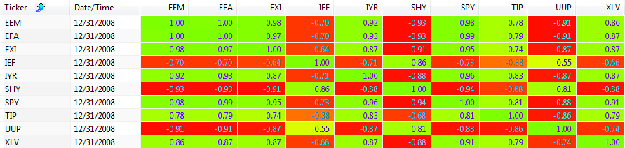
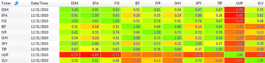
CustomMenu

Thursday, July 14, 2016

Momentum Rotation Multiple System Results

In the last two posts (here and here) we looked at the performance of a simple 60 day momentum rotation system. In this post, we will look at variations on that simple system, and how these variations performed during the same time period, using the same 10 ETF products.  The 10 ETFs used by all of the systems were:

Recall that our simple momentum rotation system only looked at the 60 day/period momentum (ROC) for ranking, and picked the one ETF with the largest positive change.  If all 10 of the ETFs in the group had a negative rate of change...a price today that was lower than the price 60 days ago, then the system moved to cash.  The system only ranked the ETFs in the portfolio on the last trading day of the month.  This is how the system shown in the past posts was structured.  The associated AmiBroker afl code can be found here.

In this post, we will look at six versions of this simple system:
  1. 20 period momentum rotation ( ROC(20) )
  2. 60 period momentum rotation ( ROC(60) )
  3. 120 period momentum rotation ( ROC(120) )
  4. 20 period / 120 period momentum rotation ( ROC(20) + ROC(120) )
  5. 20 period / 120 period smoothed momentum rotation ( ROC(20) + MA(ROC(120), 20) ) 
  6. Weighted momentum rotation ( 0.5*ROC(120) + 0.3*ROC(20) + 0.2*HV(120) )

We will review four variations of each of these six systems, and compare their performance to that of our "standard" 60 period momentum rotation system reviewed in my previous articles.  There are six equity curve charts below, one for each of the six versions listed above.  Each equity curve chart contains the following four variations:
  1. No Ftr (No Filter - NF) - select the ETF that has the greatest ROC of the 10 ETFs; positive momentum or the smallest negative momentum (green)
  2. Slope Ftr (Slope Filter - SF) - select the ETF that has the greatest positive ROC of the 10 ETFs; do not select any ETF if all 10 ETFs have negative ROC -> go to cash (blue)
  3. Brdth Ftr (Breadth Filter - BF) - select the ETF that has the greatest ROC of the 10 ETFs; positive momentum or the smallest negative momentum; if the breadth filter (based on 200 funds) is below a threshold value -> go to cash (gold)
  4. Markt Ftr (Market Filter - MA) - select the ETF that has the greatest ROC of the 10 ETFs; positive momentum or the smallest negative momentum; if the S&P 500 is below the 200 day MA on the S&P 500 -> go to cash (purple)

In addition, each of the six equity curve charts contains the equity curves for two additional systems:
  • Standard - our standard 60 period momentum rotation system with slope filter; no trades taken with negative momentum (red)
  • S&P 500 Index - buy and hold the S&P 500 (orange)

Now let's look at the equity curves for each of the six system variations...

20 Period Momentum ( ROC(20) )
(click to enlarge)
The four systems (No Ftr, Slope Ftr, Brdth Ftr, Mrkt Ftr) use as their core, a momentum system based on the 20 period rate of change (ROC(20)).  The "standard" 60 period momentum system (red) had the greatest overall return, and the four 20 period variations returned about the same as buying and holding the S&P 500 (orange).


60 Period Momentum ( ROC(60) )
(click to enlarge)
In the equity curve chart above, the red curve is the same as the blue curve; the "standard" system is the same as the 60 period system with the slope filter.  Our "standard" system had the lowest overall performance of the 60 period systems, although they all performed better than buy and hold (orange).  The best performance went to the non-filtered system variation (green).


120 Period Momentum ( ROC(120) )
(click to enlarge)
Other than the market filter variation (purple), the other three 120 period variations seem to be recovering from the 2015 performance lull fairly well.  The best performance went to the non-filtered system variation (green).  The "standard" system (red) under performed all 120 period variations.


ROC(20) + ROC(120)
(click to enlarge)
These four variations added the 20 period momentum to the 120 period momentum, yielding a composite momentum score.  The best performance again went to the non-filtered variation, with the breadth filter variation coming in second place.  All variations out performed buy and hold.


ROC(20) + MA(ROC(120), 20)
(click to enlarge)
These four variations added the 20 period momentum to the 20 period moving average of the 120 period momentum.  These variations respond more slowly to the change in the 120 period momentum.  We see the impact of this change on the steep decline in system performance in 2015.  All variations again out performed buy and hold.


Weighted System Components (3)
(click to enlarge)
Lastly, we look at four variations that are based on summing three weighted scores.  These four variations add the 120 period momentum (multiplied by 0.5) with the 20 period momentum (multiplied by 0.3) with the 120 period historical volatility (multiplied by 0.2).  The best performance went to the non-filtered variation, followed by the breadth filter variation.

For me, there were two big take-aways in reviewing these equity curves.  One, all versions and variations experienced poor performance in 2015.  Second, the non-filtered variations, in general, outperformed the other variations.  These same two trends were present in nearly all of the other 30+ product portfolios I tested with these systems.

Finally, I thought it was interesting that just this week the following article was published via QuantpediaHas Momentum Lost Its Momentum?

In the next post, I will share the AmiBroker system settings that I used for these tests, so that you can replicate the "standard" system results.


Follow my blog by email, RSS feed or Twitter (@DTRTrading).  All options are available on the top of the right hand navigation column under the headings "Subscribe To RSS Feed", "Follow By Email", and "Twitter"

Wednesday, July 6, 2016

Momentum Rotation 60 Day ROC System Metrics

It's been a while since my last post.  I had planned on writing this particular article about three months ago, but work got in the way of my writing and testing  Over the next few weeks I will try to close out this series on momentum rotation using my 60 day ROC example written for AmiBroker.  After I finish this series, I will get back to option strategy backtesting

I thought it was interesting how poorly the 60 day ROC momentum rotation system performed during 2015.  During this period, there were no consistent uptrends for the products traded by my example system.  I believe this was the primary reason for the poor performance.  I thought this might be reflected in the 250 day correlation between the products (measured at the end of each year in the test period).  The correlation tables are shown below.  Surprisingly, 2015 did not look dramatically different than some of the other years.

2003 - 250 Day Correlation
2003 250 day correlation between ETFs: EEM, EFA, FXI, IEF, IYR, SHY, SPY, TIP, UUP, and XLV
(click to enlarge)
2004 - 250 Day Correlation
2004 250 day correlation between ETFs: EEM, EFA, FXI, IEF, IYR, SHY, SPY, TIP, UUP, and XLV
(click to enlarge)
2005 - 250 Day Correlation
2005 250 day correlation between ETFs: EEM, EFA, FXI, IEF, IYR, SHY, SPY, TIP, UUP, and XLV
(click to enlarge)
2006 - 250 Day Correlation
2006 250 day correlation between ETFs: EEM, EFA, FXI, IEF, IYR, SHY, SPY, TIP, UUP, and XLV
(click to enlarge)
2007 - 250 Day Correlation
2007 250 day correlation between ETFs: EEM, EFA, FXI, IEF, IYR, SHY, SPY, TIP, UUP, and XLV
(click to enlarge)
2008 - 250 Day Correlation
2008 250 day correlation between ETFs: EEM, EFA, FXI, IEF, IYR, SHY, SPY, TIP, UUP, and XLV
(click to enlarge)
2009 - 250 Day Correlation
2009 250 day correlation between ETFs: EEM, EFA, FXI, IEF, IYR, SHY, SPY, TIP, UUP, and XLV
(click to enlarge)
2010 - 250 Day Correlation
2010 250 day correlation between ETFs: EEM, EFA, FXI, IEF, IYR, SHY, SPY, TIP, UUP, and XLV
(click to enlarge)
2011 - 250 Day Correlation
2011 250 day correlation between ETFs: EEM, EFA, FXI, IEF, IYR, SHY, SPY, TIP, UUP, and XLV
(click to enlarge)
2012 - 250 Day Correlation
2012 250 day correlation between ETFs: EEM, EFA, FXI, IEF, IYR, SHY, SPY, TIP, UUP, and XLV
(click to enlarge)
2013 - 250 Day Correlation
2013 250 day correlation between ETFs: EEM, EFA, FXI, IEF, IYR, SHY, SPY, TIP, UUP, and XLV
(click to enlarge)
2014 - 250 Day Correlation
2014 250 day correlation between ETFs: EEM, EFA, FXI, IEF, IYR, SHY, SPY, TIP, UUP, and XLV
(click to enlarge)
2015 - 250 Day Correlation
2015 250 day correlation between ETFs: EEM, EFA, FXI, IEF, IYR, SHY, SPY, TIP, UUP, and XLV
(click to enlarge)
2016 - 250 Day Correlation
2016 250 day correlation between ETFs: EEM, EFA, FXI, IEF, IYR, SHY, SPY, TIP, UUP, and XLV
(click to enlarge)

Next, I looked at the performance of this system from: 1) 2003 through 2014, 2) 2015 through the first three months of 2016, and 3) 2003 through the first three months of 2016.  These metrics are shown in the table below.

60 day momentum rotation system metrics for different yearly periods
(click to enlarge)

For 2015, there were a few metrics that jumped out at me compared to the 2003 through 2014 period:
  1. The win rate was much lower, so fewer winning trades than typical for this system
  2. The average bars held was higher for both winners and losers, so we were in the trades longer than usual before a momentum change occurred
  3. The maximum consecutive winners and losers was lower, indicating a market with no sectors with strong upward momentum...a zig zagging market
  4. The maximum trade drawdown was lower, indicating no persistent down moves before a trade was exited...weak uptrends and weak downtrends

I also reviewed Monte Carlo simulations for this system (using the same ETF products) from 2003 through 2016.  For the Monte Carlo runs, the position sizing utilized 99% of the available capital for each trade.
Equity curves for 1000 Monte Carlo simulations (2003 - 2016) for the 60 day momentum rotation system
(click to enlarge)

The actual metrics for this simulation are shown in the table below.  The backtesting and Monte Carlo simulations assumed an initial portfolio equity of $100K.

Metrics for 1000 Monte Carlo simulations (2003 - 2016) for the 60 day momentum rotation system
(click to enlarge)

90% of the observed annual return values were at or above 9.86%.  Also in 90% of cases the drawdown was less than or equal to 31.84%.  A negative return for the system should occur in less than 1% of the cases based on the data above.  For the actual bactested system, the annual return was 16.9%.  Even when I performed the simulations with a fixed number of shares per trade, rather than 99% of the portfolio equity, there were no negative annual return values in the Monte Carlo metrics tables.  Using a fixed number of shares per trade eliminates the compounding effect.

In the next article I will show the equity curves for several other momentum rotation systems trading the same products.  Do you think they will also perform poorly during 2015?


Follow my blog by email, RSS feed or Twitter (@DTRTrading).  All options are available on the top of the right hand navigation column under the headings "Subscribe To RSS Feed", "Follow By Email", and "Twitter"