- Iron Condor Results Summary - Part 1
- Iron Condor Results Summary - Part 2 - Loss Levels
- Iron Condor Results Summary - Part 3 - 2017 Results
- Iron Condor Results Summary - Part 4 - Top Performers By Metric
Background
After writing those four articles, I was a bit disappointed with the results. In Part 3, I looked at three strategy variations that appeared to be some of the strongest based on the results in Part 1 and Part 2. These variations did not have the equity curves that I was anticipating. In Part 4, I ranked the 3024 different Iron Condor strategy variations by seven metrics in order to create a composite rank for each of variation. I then looked at the top scoring variation for each of the seven metrics, while also noting that variation's composite rank. These top performing strategy variations were a bit disappointing as well.
My next step was to identify four "families" of Iron Condor strategies that had some of the best composite rank scores. Those Iron Condor "families" included:
- 80 DTE, 25 point wings, 8 delta short strikes
- 80 DTE, 25 point wings, 12 delta short strikes
- 80 DTE, 50 point wings, 16 delta short strikes
- 66 DTE, 25 point wings, 12 delta short strikes
For these "families" I looked at all of the combinations of profit targets, and stop loss for each of the different starting structures (DN, EL, ST). I tweeted the results from this analysis starting September 16 and running through October 11. Quite a few of these variations looked promising.
Correlations
Since that time, I've been looking more closely at a number of features related to the result metrics, including:
- Correlation between Iron Condor strategy structure / management and result metrics
- Which result metrics most influence equity curve shape
- Correlation between result metrics
- Correlation between initial trade conditions and trade outcome based on strategy variation
1. Correlation Between Iron Condor Structure and Metrics
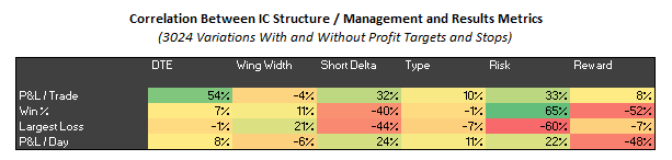
Let's take a quick look at the results from bullet one above, the correlation between Iron Condor strategy structure / management and result metrics. The correlation matrices below show the results for all 3024 strategy variations, and also the subset of 1512 strategy variations that just contain profit targets and stops.
 |
| (click to enlarge) |
 |
| (click to enlarge) |
A few points to note from the correlation matrices:
- P&L / Trade vs DTE:
The trades entered at higher DTE (i..e 80), generated greater returns per trade. You'd expect this, since we have more days of theta generation. Assuming we have two variations, with the only difference being DTE, you'd expect the higher DTE trade to generate a greater return since its DIT will typically be greater. - P&L / Trade vs Short Delta:
Higher delta short strikes generate greater returns per trade than lower delta short strikes. For example, a variation with 20 delta short strikes will typically generate greater P&L / trade than a similar variation with 8 delta short strikes. - P&L / Trade vs Risk (stop loss): Trades managed with larger risk / stops (i.e. 300% or NA) generated greater returns per trade than those managed with lower risk. With larger stops, you give the market more "room to run" inside the structure of the Iron Condor.
- Win % vs Short Delta: As the delta of the short strike decreases, Win % increases. For example, a variation with an 8 delta short strike would tend to have a higher win rate than a similar variation with a 12 delta short strike.
- Win % vs Risk (stop loss): The Win % is strongly correlated with Risk / stop level. Higher stop loss levels (i.e. 300% or NA) are associated with higher Win % numbers.
- Win % vs Reward (profit target): The Win % is negatively correlated with Reward / profit target. Variations with lower profit targets (i.e. 50%) have higher Win % numbers than variations with higher profit targets.
- Largest Loss vs Wing Width: This one is less obvious due to the way I measured Largest Loss. The larger the Wing Width, the smaller the Largest Loss. Fore example, a variation with a Wing Width of 75 would tend to have smaller losses (in terms of % of max risk) than a similar variation with 25 point wings.
- Largest Loss vs Short Delta: Again, this is less obvious due to the way I recorded Largest Loss. The larger the Short Delta, the larger the Largest Loss. A variation with short strikes at 8 delta would tend to have smaller losses (in terms of % of max risk) than a similar variation with short strikes at 20 delta.
- Largest Loss vs Risk (stop loss): The larger the Risk / stop loss, the larger the Largest Loss. For example, a variation with a 300% stop would tend to have larger losses than a similar variation with a 100% stop loss.
- P&L / Day vs Short Delta: The smaller the short strike delta, the smaller the P&L per Day. For example, a variation with short deltas at 8 would then to generate less profit per day than a similar variation with shorts at 20 delta.
- P&L / Day vs Reward (profit target): The lower the Reward / profit target, the higher the P&L per Day. For example, a variation with a profit target of 50% would tend to generate more profit per day than a similar variation with a profit target of 75%.
I'm not sure there is anything too surprising in the above correlations. Most of us would have assumed that these relationships existed, but it's nice to quantify the correlations. Also note what did not show much of a correlation:
- DTE: no significant correlation with Win%, Largest Loss, or P&L / Day
- Wing Width: no significant correlation with P&L / Trade, Win %, or P&L / Day
- Type: very minimal correlation between P&L / Day and the ST initial starting structure
- Risk (stop loss): minimal correlation between P&L / Day and stop loss level, with a larger stop generating slightly more P&L / day
- Reward (profit target): no significant correlation with P&L / Trade, or Largest Loss
2. Metrics Influencing Equity Curve Shape
Let's now find some examples of variations with smooth equity curves. We need variations with a high Win% and low Largest Loss number.
A high Win % is correlated with low deltas, high risk / stops, and low reward / profit targets. An example would be an Iron Condor with 8 delta shorts, a stop at 300% or NA, and a profit target of 50%.
A small Largest Loss number is correlated with large wing widths, low deltas, and low risk / stops. The last one is at odds with our Win % requirements. An example of a variation that meets this requirement would be an Iron Condor with 75 point wings, 8 delta shorts, and a stop at 100%.
For the smoothest equity curve, we should be looking at Iron Condors with 50 to 75 point wings, 8 to 12 delta shorts, stops in the 200% to 300% range, and a profit target of 50%.
We'll look at bullets three, and possibly four, in the next article. Also, my plan is to try to close out this Iron Condor series by the end of the year, and move on to other analysis...if all goes well.
Follow my blog by email, RSS feed or Twitter (@DTRTrading). All options are available on the top of the right hand navigation column under the headings "Subscribe To RSS Feed", "Follow By Email", and "Twitter".
No comments:
Post a Comment